CSS美化链接下划线技巧分享
2026-01-02 18:32:38
0浏览
收藏
大家好,我们又见面了啊~本文《CSS下划线美化链接样式技巧》的内容中将会涉及到等等。如果你正在学习文章相关知识,欢迎关注我,以后会给大家带来更多文章相关文章,希望我们能一起进步!下面就开始本文的正式内容~
使用 text-decoration 可设置链接下划线,通过 line、color、style、thickness 实现精细控制;2. 自定义样式如蓝色虚线并悬停加粗可提升体验;3. 用 border-bottom 替代可避免穿过 descender,视觉更整洁。

在网页设计中,链接的视觉表现很重要,使用 CSS text-decoration 属性可以轻松为文本添加下划线,并进一步美化链接样式,使其更具吸引力和可用性。
基本下划线设置
通过 text-decoration: underline 可以为链接添加默认下划线。这是链接最常见的样式,浏览器通常默认启用。
a {text-decoration: underline;
}
但默认下划线可能显得生硬。CSS 提供了更精细的控制方式:
- text-decoration-line:指定装饰类型(如 underline、overline、line-through)
- text-decoration-color:设置下划线颜色
- text-decoration-style:定义线条样式(实线、虚线、波浪线等)
- text-decoration-thickness:调整下划线粗细
美化链接下划线示例
想要让链接更现代,可以自定义下划线样式。例如,使用较细的蓝色虚线下划线:
a {text-decoration-line: underline;
text-decoration-style: dashed;
text-decoration-color: #007acc;
text-decoration-thickness: 1px;
transition: text-decoration-thickness 0.2s;
}
a:hover {
text-decoration-thickness: 2px;
}
这样在鼠标悬停时,下划线会变粗,带来轻微动态反馈,提升用户体验。
替代方案:使用 border-bottom
有时使用 border-bottom 比 text-decoration 更灵活,特别是需要精确控制间距时:
a {text-decoration: none;
border-bottom: 2px solid #005a9e;
padding-bottom: 2px;
}
这种方法避免了下划线穿过字母 descender(如 g、p)的问题,视觉上更整洁。
基本上就这些。合理使用 text-decoration 或 border-bottom,能让链接既清晰又美观。
今天关于《CSS美化链接下划线技巧分享》的内容介绍就到此结束,如果有什么疑问或者建议,可以在golang学习网公众号下多多回复交流;文中若有不正之处,也希望回复留言以告知!
 HTML5注释使用方法及带注释文档插入技巧
- 上一篇
- HTML5注释使用方法及带注释文档插入技巧
- 下一篇
- CSS子选择器与后代选择器区别解析
查看更多
最新文章
-
- 文章 · 前端 | 3小时前 |
- Firefox透明文字显示问题解决方法
- 176浏览 收藏
-
- 文章 · 前端 | 3小时前 |
- HTML单页应用实现原理详解
- 393浏览 收藏
-

- 文章 · 前端 | 3小时前 |
- 品牌Logo滚动展示实现教程
- 255浏览 收藏
-
- 文章 · 前端 | 3小时前 |
- CSSflex简写属性详解
- 376浏览 收藏
-

- 文章 · 前端 | 3小时前 |
- HTML表格导出Excel的实用方法
- 356浏览 收藏
-
- 文章 · 前端 | 3小时前 |
- HTML5BroadcastChannel实现多标签通信方法
- 407浏览 收藏
-

- 文章 · 前端 | 3小时前 |
- HTML中samp标签怎么用
- 293浏览 收藏
-
- 文章 · 前端 | 3小时前 |
- HTML5mark标签使用教程:文本高亮方法
- 471浏览 收藏
-
- 文章 · 前端 | 3小时前 |
- 搭建支持SSR的前端框架指南
- 400浏览 收藏
-

- 文章 · 前端 | 3小时前 |
- HTML压缩技巧|提升网站性能攻略
- 127浏览 收藏
-

- 文章 · 前端 | 4小时前 |
- JavaScript操控无人机方法详解
- 304浏览 收藏
-

- 文章 · 前端 | 4小时前 |
- BEM结构化CSS编写教程
- 290浏览 收藏

查看更多
课程推荐
-

- 前端进阶之JavaScript设计模式
- 设计模式是开发人员在软件开发过程中面临一般问题时的解决方案,代表了最佳的实践。本课程的主打内容包括JS常见设计模式以及具体应用场景,打造一站式知识长龙服务,适合有JS基础的同学学习。
- 543次学习
-

- GO语言核心编程课程
- 本课程采用真实案例,全面具体可落地,从理论到实践,一步一步将GO核心编程技术、编程思想、底层实现融会贯通,使学习者贴近时代脉搏,做IT互联网时代的弄潮儿。
- 516次学习
-

- 简单聊聊mysql8与网络通信
- 如有问题加微信:Le-studyg;在课程中,我们将首先介绍MySQL8的新特性,包括性能优化、安全增强、新数据类型等,帮助学生快速熟悉MySQL8的最新功能。接着,我们将深入解析MySQL的网络通信机制,包括协议、连接管理、数据传输等,让
- 500次学习
-

- JavaScript正则表达式基础与实战
- 在任何一门编程语言中,正则表达式,都是一项重要的知识,它提供了高效的字符串匹配与捕获机制,可以极大的简化程序设计。
- 487次学习
-

- 从零制作响应式网站—Grid布局
- 本系列教程将展示从零制作一个假想的网络科技公司官网,分为导航,轮播,关于我们,成功案例,服务流程,团队介绍,数据部分,公司动态,底部信息等内容区块。网站整体采用CSSGrid布局,支持响应式,有流畅过渡和展现动画。
- 485次学习
查看更多
AI推荐
-
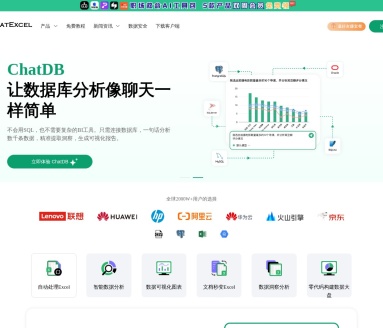
- ChatExcel酷表
- ChatExcel酷表是由北京大学团队打造的Excel聊天机器人,用自然语言操控表格,简化数据处理,告别繁琐操作,提升工作效率!适用于学生、上班族及政府人员。
- 4430次使用
-
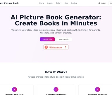
- Any绘本
- 探索Any绘本(anypicturebook.com/zh),一款开源免费的AI绘本创作工具,基于Google Gemini与Flux AI模型,让您轻松创作个性化绘本。适用于家庭、教育、创作等多种场景,零门槛,高自由度,技术透明,本地可控。
- 4789次使用
-

- 可赞AI
- 可赞AI,AI驱动的办公可视化智能工具,助您轻松实现文本与可视化元素高效转化。无论是智能文档生成、多格式文本解析,还是一键生成专业图表、脑图、知识卡片,可赞AI都能让信息处理更清晰高效。覆盖数据汇报、会议纪要、内容营销等全场景,大幅提升办公效率,降低专业门槛,是您提升工作效率的得力助手。
- 4667次使用
-
- 星月写作
- 星月写作是国内首款聚焦中文网络小说创作的AI辅助工具,解决网文作者从构思到变现的全流程痛点。AI扫榜、专属模板、全链路适配,助力新人快速上手,资深作者效率倍增。
- 6451次使用
-
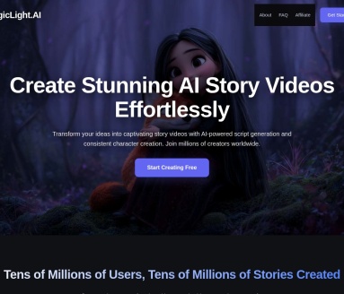
- MagicLight
- MagicLight.ai是全球首款叙事驱动型AI动画视频创作平台,专注于解决从故事想法到完整动画的全流程痛点。它通过自研AI模型,保障角色、风格、场景高度一致性,让零动画经验者也能高效产出专业级叙事内容。广泛适用于独立创作者、动画工作室、教育机构及企业营销,助您轻松实现创意落地与商业化。
- 5039次使用
查看更多
相关文章
-
- JavaScript函数定义及示例详解
- 2025-05-11 502浏览
-
- 优化用户界面体验的秘密武器:CSS开发项目经验大揭秘
- 2023-11-03 501浏览
-
- 使用微信小程序实现图片轮播特效
- 2023-11-21 501浏览
-
- 解析sessionStorage的存储能力与限制
- 2024-01-11 501浏览
-
- 探索冒泡活动对于团队合作的推动力
- 2024-01-13 501浏览