CSS实现单选框样式技巧
本文深入讲解了如何仅用纯CSS实现高度自定义的单选框样式,核心在于巧妙运用:checked伪类与label标签的联动:通过appearance: none和opacity: 0隐藏原生radio按钮,再借助相邻(+)或兄弟(~)选择器精准控制label或关联元素的视觉状态,轻松打造出圆点按钮、卡片选择、主题切换开关等现代UI效果;文中不仅提供了可直接复用的代码片段,还强调了结构优化技巧(如将input嵌入label以省去id绑定)和易错细节(如确保点击区域完整),让开发者无需JavaScript即可实现美观、语义化且可访问的表单交互。
使用 :checked 伪类可以完全通过 CSS 控制单选框(radio button)的样式,隐藏默认外观并自定义视觉效果。核心思路是结合 HTML 的 input[type="radio"] 和对应的 label,利用 :checked 状态切换样式。
1. 基本结构与隐藏原生单选框
先写出标准的 radio 输入框和 label 标签,并用 CSS 隐藏原始输入框。
CSS 中将 input 隐藏:
input[type="radio"] {
  appearance: none;
  -webkit-appearance: none;
  opacity: 0;
  position: absolute;
}
2. 自定义 label 样式作为按钮
让 label 显示为可点击的按钮或圆圈样式,并通过 +:checked + 或 ~ 选择器控制外观。
示例:制作圆形单选按钮
label {
  display: inline-block;
  width: 20px;
  height: 20px;
  border: 2px solid #ccc;
  border-radius: 50%;
  margin-right: 8px;
  cursor: pointer;
  position: relative;
}
/ 选中状态样式 /
input[type="radio"]:checked + label::after {
content: '';
position: absolute;
top: 50%;
left: 50%;
transform: translate(-50%, -50%);
width: 10px;
height: 10px;
background-color: #007acc;
border-radius: 50%;
}
3. 使用 label 包裹 input 实现更简洁结构
推荐写法:把 input 放进 label 内部,无需 for 和 id,结构更清晰。
对应 CSS:
label {
padding: 8px 12px;
border: 2px solid #ddd;
border-radius: 6px;
margin: 4px;
display: inline-block;
cursor: pointer;
}
input[type="radio"] {
appearance: none;
}
input[type="radio"]:checked + label {
background-color: #007acc;
color: white;
border-color: #005a87;
}
4. 扩展:制作开关或卡片选择样式
你可以基于相同原理实现更复杂的 UI,比如主题切换开关或卡片选择。
例如:卡片式选择
.card {
  padding: 16px;
  border: 2px solid #e0e0e0;
  border-radius: 8px;
  width: 120px;
  text-align: center;
}
input[type="radio"]:checked ~ .card {
border-color: #007acc;
background-color: #f0f7ff;
box-shadow: 0 0 4px rgba(0, 122, 204, 0.3);
}
基本上就这些。关键是理解 :checked 如何与 label 联动,再通过相邻或兄弟选择器改变样式。不复杂但容易忽略细节,比如隐藏原生 input 和确保点击区域正确。
今天关于《CSS实现单选框样式技巧》的内容介绍就到此结束,如果有什么疑问或者建议,可以在golang学习网公众号下多多回复交流;文中若有不正之处,也希望回复留言以告知!
 PHP输出缓冲ob_start如何控制页面渲染
- 上一篇
- PHP输出缓冲ob_start如何控制页面渲染

- 下一篇
- Golang sync.Pool对象复用教程与避坑指南
-
- 文章 · 前端 | 1天前 | 前端 · 性能优化 · css · Core Web Vitals · 渲染性能 · 前端 渲染性能 CSS性能 CLS content-visibility contain-intrinsic-size Layout
- 前端长页面渲染卡顿怎么排查:用 content-visibility 跳过离屏区块
- 430浏览 收藏
-
- 文章 · 前端 | 1星期前 | 前端 · javascript · AbortController · 表单提交 · AbortController 旧响应覆盖 前端重复提交 loading锁 fetch取消 按钮防抖
- 前端按钮重复提交怎么办:loading 锁和 AbortController 最小配方
- 442浏览 收藏
-
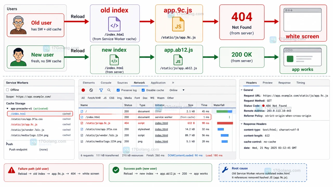
- 文章 · 前端 | 1星期前 | 前端 · 缓存 · Service Worker · 白屏 · 发布故障 · 缓存策略 前端白屏 Service Worker CacheStorage 资源404 发布回滚
- 前端发布后白屏复盘:Service Worker 缓存旧入口导致 JS 资源 404
- 469浏览 收藏
-
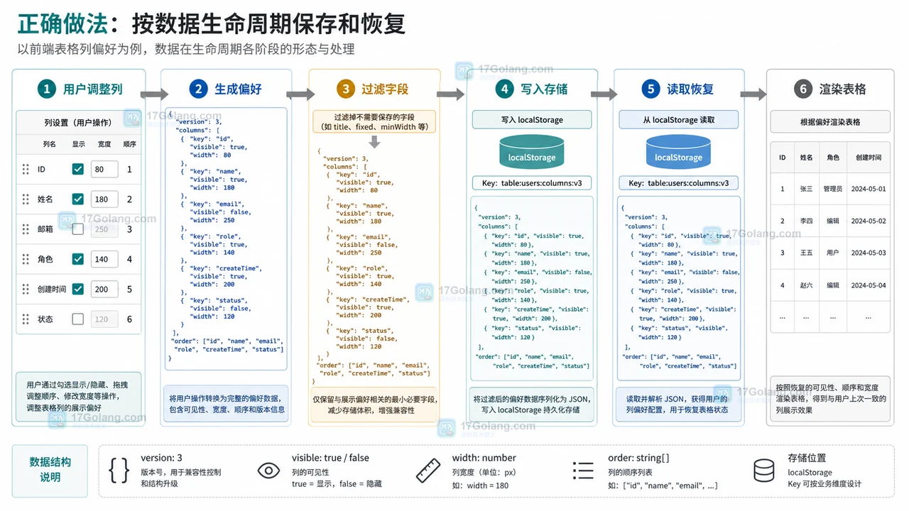
- 文章 · 前端 | 1星期前 | 前端开发 · localStorage · 表格配置 · 用户偏好 · 后台系统 · 用户偏好 localStorage 前端表格 列配置 可见列 列宽保存
- 前端表格列设置刷新后丢失怎么办:可见列、列宽和顺序这样保存
- 351浏览 收藏
-
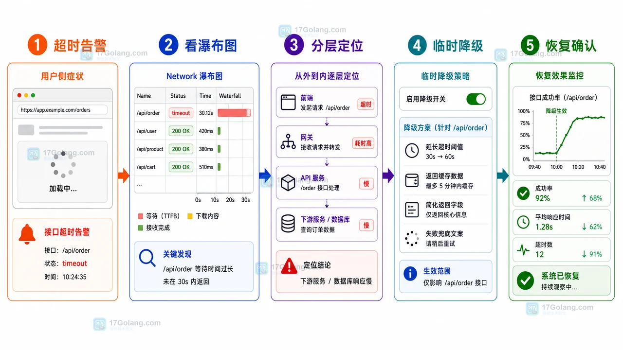
- 文章 · 前端 | 1星期前 | 前端 · 接口排查 · 运维手册 · 性能告警 · 前端 AbortController 接口超时 Network瀑布图 降级回滚 线上告警
- 前端接口超时告警运行手册:从瀑布图到降级回滚
- 287浏览 收藏
-

- 前端进阶之JavaScript设计模式
- 设计模式是开发人员在软件开发过程中面临一般问题时的解决方案,代表了最佳的实践。本课程的主打内容包括JS常见设计模式以及具体应用场景,打造一站式知识长龙服务,适合有JS基础的同学学习。
- 543次学习
-

- GO语言核心编程课程
- 本课程采用真实案例,全面具体可落地,从理论到实践,一步一步将GO核心编程技术、编程思想、底层实现融会贯通,使学习者贴近时代脉搏,做IT互联网时代的弄潮儿。
- 516次学习
-

- 简单聊聊mysql8与网络通信
- 如有问题加微信:Le-studyg;在课程中,我们将首先介绍MySQL8的新特性,包括性能优化、安全增强、新数据类型等,帮助学生快速熟悉MySQL8的最新功能。接着,我们将深入解析MySQL的网络通信机制,包括协议、连接管理、数据传输等,让
- 500次学习
-

- JavaScript正则表达式基础与实战
- 在任何一门编程语言中,正则表达式,都是一项重要的知识,它提供了高效的字符串匹配与捕获机制,可以极大的简化程序设计。
- 487次学习
-

- 从零制作响应式网站—Grid布局
- 本系列教程将展示从零制作一个假想的网络科技公司官网,分为导航,轮播,关于我们,成功案例,服务流程,团队介绍,数据部分,公司动态,底部信息等内容区块。网站整体采用CSSGrid布局,支持响应式,有流畅过渡和展现动画。
- 485次学习
-

- ljg-skills
- ljg-skills 是李继刚开源的 AI 技能与提示词集合,面向大模型使用者整理了一批可复用的 prompt、角色设定和任务技能模板,适合用于学习提示词设计、搭建个人 AI 工作流和沉淀团队常用智能体能力。
- 4401次使用
-

- MELO音乐
- MELO音乐是一站式AI视频与音乐制作助手,对标suno, udio的高品质体验。提供伴奏生成、原创写词、无损导出、哼唱识曲、混音变声等全套音频与短视频编辑工具。无论是流行Kpop、电音说唱、民谣古风、摇滚儿歌还是商用轻音乐,MELO为你免费谱曲,轻松做同款!
- 4069次使用
-

- UniScribe
- UniScribe 是一款 AI 音视频转文字与内容整理工具,支持上传音频、视频文件或粘贴 YouTube 链接,自动生成转写文本、摘要、思维导图和关键问题,并支持多格式导出,适合会议记录、课程学习、访谈整理和内容创作复盘。
- 4052次使用
-

- 剧云
- 剧云是专业中文剧本创作平台,安全稳定运行十余年,集成AI编剧、剧本医生审核、人物小传、剧情关系图、大纲编写、多人协作、Word导入导出、版权管控功能,数据安全防护,轻松高效创作剧本。
- 4235次使用
-

- 万象有声
- 万象有声,一个专为有声创作者打造的新一代智能有声内容创作平台。平台提供专业的智能拆章、智能画本编辑、AI配音、AI生成音效、后期制作、智能对轨、智能审听等有声创作全流程工具,可以帮助创作者高效、低成本创作出引人入胜的有声作品。立即体验,让有声书制作更简单!
- 4209次使用
-
- JavaScript函数定义及示例详解
- 2025-05-11 502浏览
-
- CSS变量简化按钮悬停效果技巧
- 2026-05-31 501浏览
-
- JavaScript符号类型详解与应用
- 2026-05-31 501浏览
-
- HTML剪贴板复制粘贴怎么用
- 2026-05-26 501浏览
-
- data-*属性详解:HTML数据存储与DOM操作技巧
- 2026-05-25 501浏览