WebComponents自定义元素入门教程
积累知识,胜过积蓄金银!毕竟在文章开发的过程中,会遇到各种各样的问题,往往都是一些细节知识点还没有掌握好而导致的,因此基础知识点的积累是很重要的。下面本文《Web Components实现自定义元素教程》,就带大家讲解一下知识点,若是你对本文感兴趣,或者是想搞懂其中某个知识点,就请你继续往下看吧~
使用Web Components可创建独立可复用的自定义元素,1. 通过继承HTMLElement并用customElements.define()注册组件;2. 利用影子DOM实现样式和结构隔离;3. 结合template标签提升代码组织性与性能;4. 使用slot插入外部内容以增强灵活性;5. 通过observedAttributes和attributeChangedCallback响应属性变化。该技术不依赖框架,适合构建跨项目UI库,需注意浏览器兼容性。

使用 Web Components 构建可复用的自定义 HTML 元素,核心在于利用浏览器原生支持的几项技术:自定义元素(Custom Elements)、影子 DOM(Shadow DOM)和 HTML 模板(template)。通过它们可以封装样式、结构和行为,实现真正独立、可复用的组件。
定义自定义元素
要创建一个可复用的自定义元素,首先需要继承 HTMLElement 并通过 customElements.define() 注册。元素名称必须包含连字符(-),以避免与原生 HTML 标签冲突。
例如:class MyButton extends HTMLElement {
constructor() {
super();
this.textContent = this.getAttribute('label') || '点击我';
this.style.padding = '10px 20px';
this.style.backgroundColor = '#007bff';
this.style.color = 'white';
this.style.borderRadius = '4px';
this.style.display = 'inline-block';
this.style.cursor = 'pointer';
}
connectedCallback() {
this.addEventListener('click', () => {
alert('按钮被点击!');
});
}
}
customElements.define('my-button', MyButton);
之后就可以在 HTML 中使用:
使用影子 DOM 封装样式和结构
为了让组件样式不被外部影响,也防止组件内部样式泄漏到全局,应使用影子 DOM。在构造函数中调用 this.attachShadow({ mode: 'open' }) 创建影子根。
改进后的例子:class MyCard extends HTMLElement {
constructor() {
super();
const shadow = this.attachShadow({ mode: 'open' });
const wrapper = document.createElement('div');
const title = document.createElement('h3');
const content = document.createElement('p');
title.textContent = this.getAttribute('title') || '默认标题';
content.textContent = this.getAttribute('content') || '这是内容';
const style = document.createElement('style');
style.textContent = `
div {
border: 1px solid #ddd;
border-radius: 8px;
padding: 16px;
background: #f9f9f9;
font-family: sans-serif;
}
h3 { color: #333; margin-top: 0; }
p { color: #555; }
`;
wrapper.appendChild(title);
wrapper.appendChild(content);
shadow.appendChild(style);
shadow.appendChild(wrapper);
}
}
customElements.define('my-card', MyCard);
现在这个卡片组件的样式完全隔离,不会受页面其他 CSS 影响。
结合 template 提高可维护性
对于结构较复杂的组件,推荐使用 标签预定义 DOM 结构,提升代码组织性和性能。
HTML 中定义模板:JS 中使用模板:
class MyModal extends HTMLElement {
  constructor() {
    super();
    const template = document.getElementById('my-modal-template');
    const content = template.content.cloneNode(true);
    this.shadowRoot = this.attachShadow({ mode: 'open' });
    this.shadowRoot.appendChild(content);

    this.modal = this.shadowRoot.querySelector('.modal');
  }

  show() {
    this.modal.classList.add('active');
  }

  hide() {
    this.modal.classList.remove('active');
  }
}

customElements.define('my-modal', MyModal);
通过 slot 可以让使用者传入自定义内容,增强灵活性。
监听属性变化响应更新
如果希望组件对属性变化做出反应,可以使用 static get observedAttributes() 定义需监听的属性,并实现 attributeChangedCallback 方法。
示例:class MyInput extends HTMLElement {
static get observedAttributes() {
return ['value', 'disabled'];
}
attributeChangedCallback(name, oldValue, newValue) {
if (name === 'value') {
this.input.value = newValue;
}
if (name === 'disabled') {
this.input.disabled = newValue !== null;
}
}
constructor() {
super();
this.attachShadow({ mode: 'open' });
this.input = document.createElement('input');
this.shadowRoot.appendChild(this.input);
}
}
customElements.define('my-input', MyInput);
这样当设置
基本上就这些。Web Components 不依赖任何框架,适合构建跨项目、跨团队使用的 UI 组件库。虽然功能强大,但要注意浏览器兼容性,必要时引入 polyfill。关键是合理封装、暴露清晰 API,才能真正实现“一次编写,到处复用”。
好了,本文到此结束,带大家了解了《WebComponents自定义元素入门教程》,希望本文对你有所帮助!关注golang学习网公众号,给大家分享更多文章知识!
 天眼查查经营范围方法及企业查询技巧
- 上一篇
- 天眼查查经营范围方法及企业查询技巧

- 下一篇
- 高德地图组队出行教程:位置共享与对讲方法
-
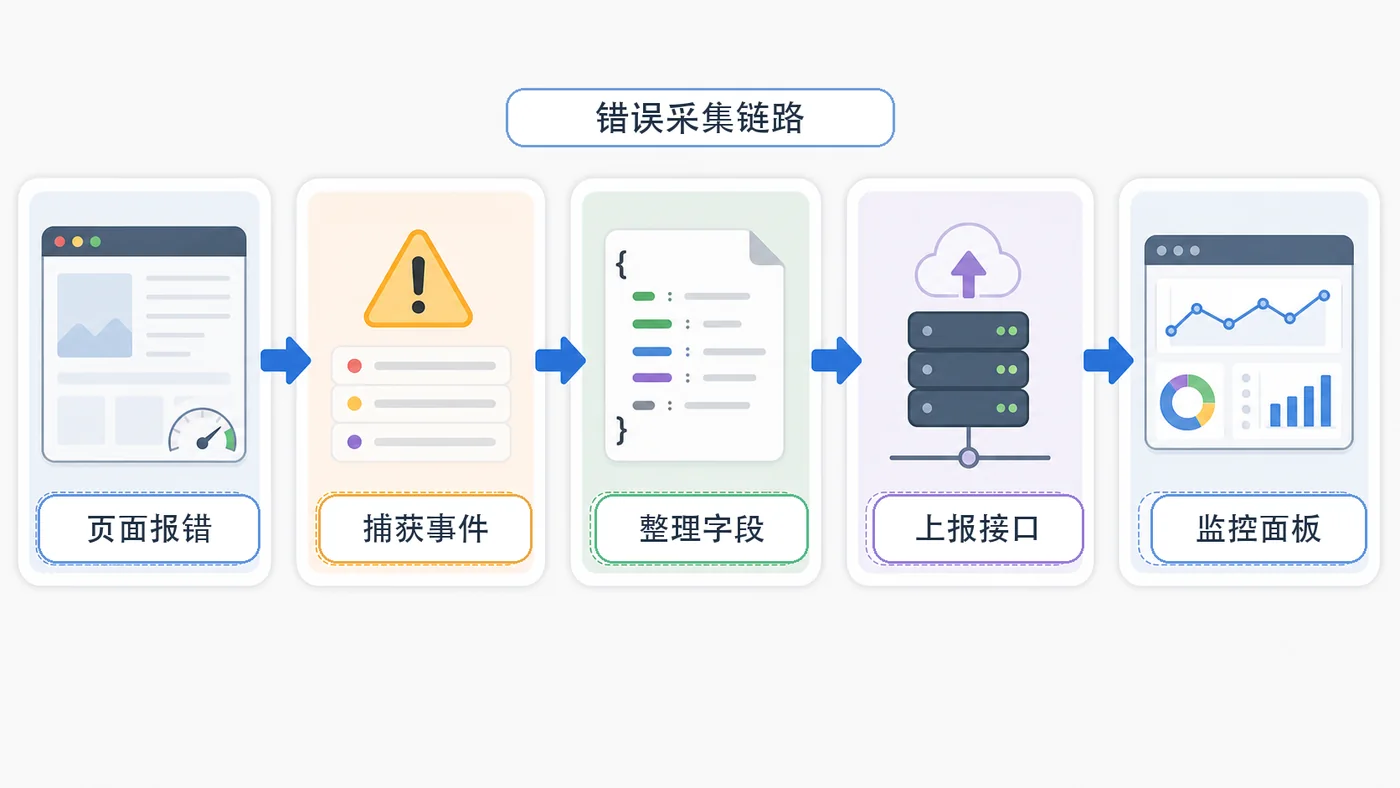
- 文章 · 前端 | 7小时前 | 前端 · javascript · sourcemap · 错误监控 · 线上排查 · 前端 错误监控 告警 onerror sourcemap unhandledrejection
- 前端错误监控实战:onerror、unhandledrejection 和 sourcemap 定位问题
- 331浏览 收藏
-
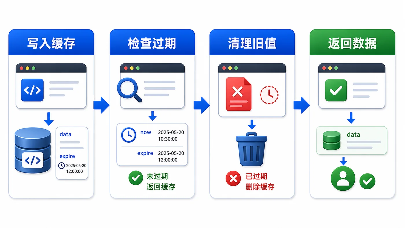
- 文章 · 前端 | 8小时前 | 前端 · javascript · 缓存治理 · localStorage · Web性能 · 前端 本地缓存 localStorage 过期时间 版本迁移 异常兜底
- 前端 localStorage 缓存治理实战:过期时间、版本号和异常兜底
- 480浏览 收藏
-
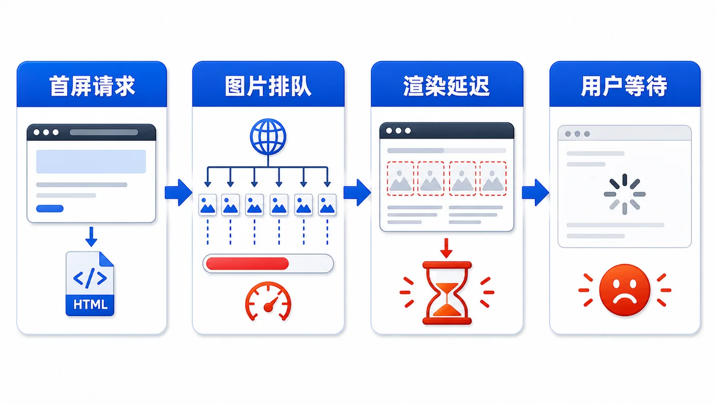
- 文章 · 前端 | 8小时前 | 前端 · 性能优化 · javascript · 图片优化 · IntersectionObserver · 前端 性能优化 图片懒加载 IntersectionObserver Web性能 首屏优化
- 前端图片懒加载实战:用 IntersectionObserver 降低首屏压力
- 184浏览 收藏
-
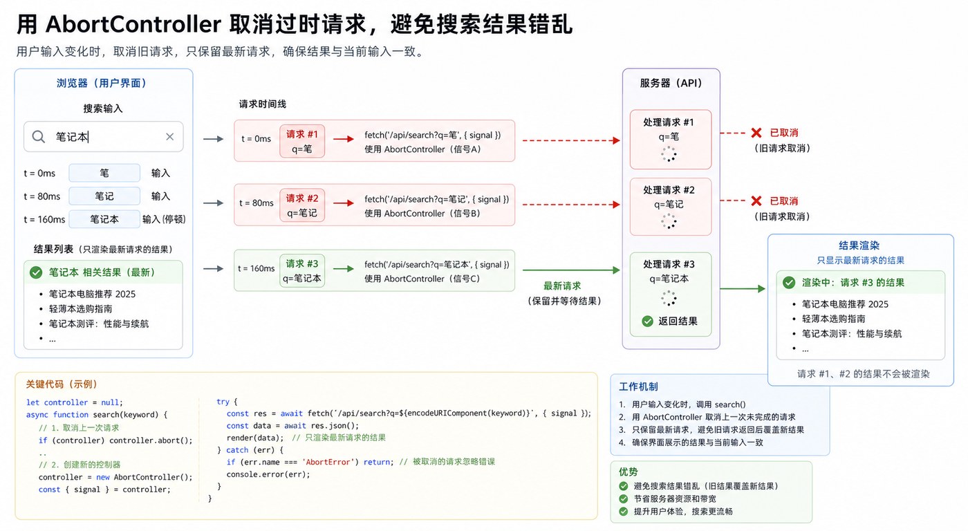
- 文章 · 前端 | 1天前 | 前端 · 性能优化 · javascript · fetch · 前端 搜索优化 Fetch AbortController 请求竞态
- 前端搜索竞态治理实战:用 AbortController 取消过期请求
- 178浏览 收藏
-
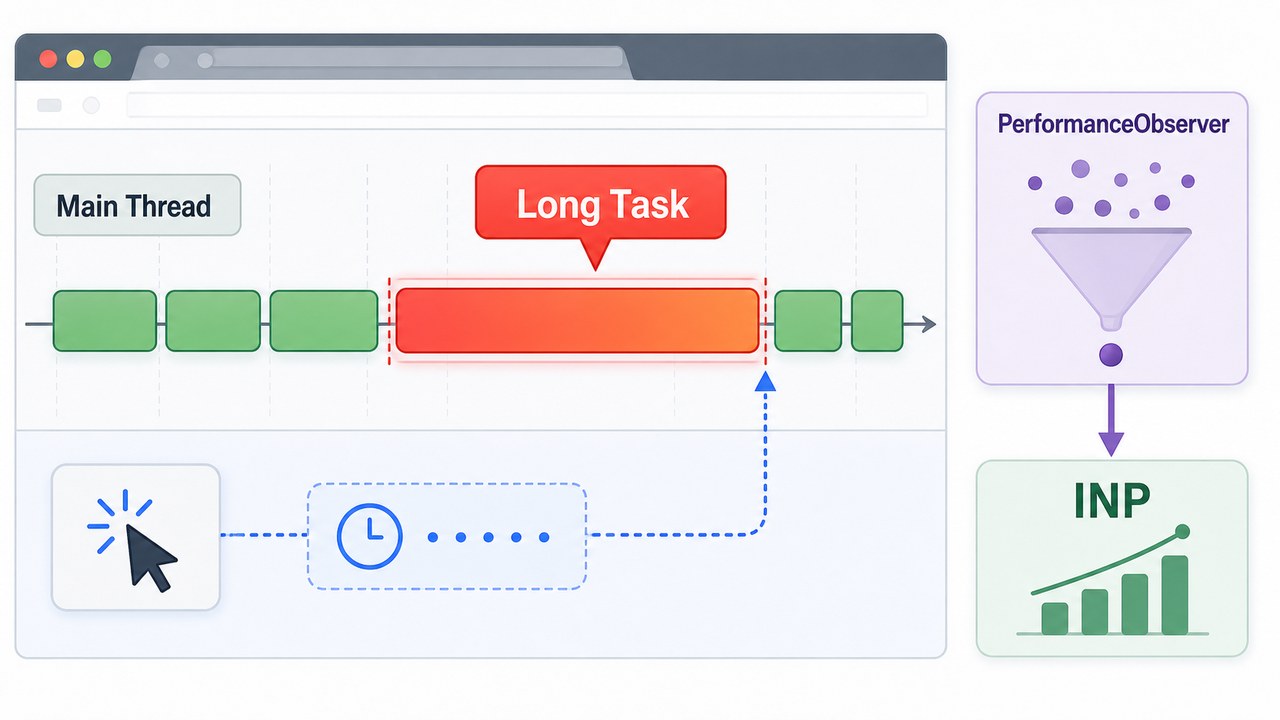
- 文章 · 前端 | 1天前 |
- 前端长任务治理实战:用 PerformanceObserver 找出页面卡顿源头
- 423浏览 收藏
-
- 文章 · 前端 | 1星期前 |
- CSS数字显示统一技巧,OpenType特性应用方法
- 209浏览 收藏
-
- 文章 · 前端 | 1星期前 |
- PerformanceAPI全生命周期预警指南
- 147浏览 收藏
-

- 文章 · 前端 | 1星期前 |
- 一个按钮控制多个状态的实现方式
- 360浏览 收藏
-

- 文章 · 前端 | 1星期前 |
- CSSGrid子元素排序技巧分享
- 155浏览 收藏
-
- 文章 · 前端 | 1星期前 |
- FIMO支持透明度设置吗?
- 393浏览 收藏
-

- 前端进阶之JavaScript设计模式
- 设计模式是开发人员在软件开发过程中面临一般问题时的解决方案,代表了最佳的实践。本课程的主打内容包括JS常见设计模式以及具体应用场景,打造一站式知识长龙服务,适合有JS基础的同学学习。
- 543次学习
-

- GO语言核心编程课程
- 本课程采用真实案例,全面具体可落地,从理论到实践,一步一步将GO核心编程技术、编程思想、底层实现融会贯通,使学习者贴近时代脉搏,做IT互联网时代的弄潮儿。
- 516次学习
-

- 简单聊聊mysql8与网络通信
- 如有问题加微信:Le-studyg;在课程中,我们将首先介绍MySQL8的新特性,包括性能优化、安全增强、新数据类型等,帮助学生快速熟悉MySQL8的最新功能。接着,我们将深入解析MySQL的网络通信机制,包括协议、连接管理、数据传输等,让
- 500次学习
-

- JavaScript正则表达式基础与实战
- 在任何一门编程语言中,正则表达式,都是一项重要的知识,它提供了高效的字符串匹配与捕获机制,可以极大的简化程序设计。
- 487次学习
-

- 从零制作响应式网站—Grid布局
- 本系列教程将展示从零制作一个假想的网络科技公司官网,分为导航,轮播,关于我们,成功案例,服务流程,团队介绍,数据部分,公司动态,底部信息等内容区块。网站整体采用CSSGrid布局,支持响应式,有流畅过渡和展现动画。
- 485次学习
-
- ChatExcel酷表
- ChatExcel酷表是由北京大学团队打造的Excel聊天机器人,用自然语言操控表格,简化数据处理,告别繁琐操作,提升工作效率!适用于学生、上班族及政府人员。
- 8146次使用
-
- Any绘本
- 探索Any绘本(anypicturebook.com/zh),一款开源免费的AI绘本创作工具,基于Google Gemini与Flux AI模型,让您轻松创作个性化绘本。适用于家庭、教育、创作等多种场景,零门槛,高自由度,技术透明,本地可控。
- 8576次使用
-

- 可赞AI
- 可赞AI,AI驱动的办公可视化智能工具,助您轻松实现文本与可视化元素高效转化。无论是智能文档生成、多格式文本解析,还是一键生成专业图表、脑图、知识卡片,可赞AI都能让信息处理更清晰高效。覆盖数据汇报、会议纪要、内容营销等全场景,大幅提升办公效率,降低专业门槛,是您提升工作效率的得力助手。
- 8399次使用
-
- 星月写作
- 星月写作是国内首款聚焦中文网络小说创作的AI辅助工具,解决网文作者从构思到变现的全流程痛点。AI扫榜、专属模板、全链路适配,助力新人快速上手,资深作者效率倍增。
- 10310次使用
-

- MagicLight
- MagicLight.ai是全球首款叙事驱动型AI动画视频创作平台,专注于解决从故事想法到完整动画的全流程痛点。它通过自研AI模型,保障角色、风格、场景高度一致性,让零动画经验者也能高效产出专业级叙事内容。广泛适用于独立创作者、动画工作室、教育机构及企业营销,助您轻松实现创意落地与商业化。
- 9196次使用
-
- JavaScript函数定义及示例详解
- 2025-05-11 502浏览
-
- 优化用户界面体验的秘密武器:CSS开发项目经验大揭秘
- 2023-11-03 501浏览
-
- 使用微信小程序实现图片轮播特效
- 2023-11-21 501浏览
-
- 解析sessionStorage的存储能力与限制
- 2024-01-11 501浏览
-
- 探索冒泡活动对于团队合作的推动力
- 2024-01-13 501浏览