CSS玩转表单美化,超简单技巧大公开!
想让你的表单更美观、用户体验更佳吗?本文为你带来CSS表单美化技巧大放送!首先,我们将探讨如何使用CSS重置表单的默认样式,解决浏览器默认样式差异问题,例如利用Normalize.css或自定义CSS规则清除边距、内边距和边框,统一字体和背景。接着,我们将深入研究如何设计美观的表单标签(label),定制不同类型的输入框(input)样式,以及优化textarea文本域和美化select下拉选择框。此外,本文还将介绍如何添加表单验证的样式反馈,以及如何让表单在不同设备上自适应,打造响应式表单。掌握这些CSS技巧,让你的表单焕然一新,提升用户填写体验!
要使用CSS重置表单默认样式,第一步是清除浏览器默认样式差异。1. 使用Normalize.css或自定义重置规则,如清除margin、padding、border等属性,并设置字体、背景和颜色继承;2. 针对特定元素如button、input[type="submit"]添加cursor: pointer和移除-appearance样式;3. 对input[type="number"]单独处理,去除上下箭头。通过这些步骤可以实现表单样式的统一和干净起点。
CSS设置表单样式,本质上就是利用CSS的各种属性来控制表单元素的外观,让它们更符合网站的整体设计风格。这不仅仅是简单的颜色和字体调整,更是关乎用户体验的重要一环。

美化表单,让用户填写信息更愉悦。
如何使用CSS重置表单默认样式?
很多浏览器都有自己的默认表单样式,这些样式往往不一致,影响美观和统一性。所以,第一步通常是进行CSS重置。
你可以使用现成的CSS重置文件,比如Normalize.css,它能抹平不同浏览器之间的差异,让你的表单样式有一个更干净的起点。
或者,你可以自己编写简单的重置规则,例如:
input,
textarea,
select,
button {
  margin: 0;
  padding: 0;
  border: none;
  outline: none;
  box-shadow: none;
  font-size: 100%; /* 继承父元素的字体大小 */
  font-family: inherit; /* 继承父元素的字体 */
  vertical-align: baseline; /* 垂直对齐方式 */
  background: transparent; /* 背景透明 */
  color: inherit; /* 继承父元素的颜色 */
}

/* 针对特定元素的一些额外重置 */
textarea {
  overflow: auto; /* 允许滚动条 */
  resize: vertical; /* 允许垂直方向调整大小 */
}

button,
input[type="submit"],
input[type="reset"] {
  cursor: pointer; /* 鼠标悬停时显示手型 */
  -webkit-appearance: none; /* 移除默认样式,兼容webkit内核浏览器 */
  -moz-appearance: none; /* 移除默认样式,兼容firefox浏览器 */
  appearance: none; /* 移除默认样式 */
}

input[type="number"]::-webkit-outer-spin-button,
input[type="number"]::-webkit-inner-spin-button {
  -webkit-appearance: none;
  margin: 0;
}

input[type="number"] {
  -moz-appearance: textfield;
}这段代码清除了input、textarea、select、button等元素的默认边距、内边距、边框等,并设置了一些通用的样式,比如字体继承、背景透明等。 注意input[type="number"]的特殊处理,是为了去除数字输入框的上下箭头,不同浏览器内核的处理方式略有差异。
如何设计美观的表单标签(label)?
label标签是表单中非常重要的组成部分,它不仅提供了文本描述,还增强了表单的可访问性。
- 对齐方式: 常见的做法是将
label放在输入框的左侧或上方。使用display: inline-block可以方便地控制label的宽度和对齐方式。
label {
  display: inline-block;
  width: 120px; /* 固定宽度,方便对齐 */
  text-align: right; /* 右对齐 */
  margin-right: 10px; /* 与输入框之间留出间距 */
}- 字体和颜色: 选择合适的字体和颜色,使其与整体风格协调。
label {
  font-weight: bold; /* 加粗字体 */
  color: #333; /* 深灰色 */
}- 辅助提示: 可以使用
title属性或额外的span标签来提供更详细的提示信息。
- 状态反馈: 使用CSS伪类,例如
:hover、:focus,来提供交互反馈。
label:hover {
  color: #007bff; /* 鼠标悬停时改变颜色 */
}
如何定制不同类型的输入框(input)样式?
不同类型的input元素(文本框、密码框、单选框、复选框等)需要不同的样式处理。
- 文本框和密码框:
input[type="text"],
input[type="password"] {
  width: 200px; /* 设置宽度 */
  padding: 8px 12px; /* 设置内边距 */
  border: 1px solid #ccc; /* 设置边框 */
  border-radius: 4px; /* 设置圆角 */
  box-sizing: border-box; /* 包含内边距和边框 */
}

input[type="text"]:focus,
input[type="password"]:focus {
  border-color: #007bff; /* 聚焦时改变边框颜色 */
  box-shadow: 0 0 5px rgba(0, 123, 255, 0.5); /* 聚焦时添加阴影 */
}- 单选框和复选框: 单选框和复选框的默认样式比较简陋,通常需要自定义样式。一种常见的做法是隐藏原生的
input元素,然后使用label和CSS伪元素来模拟单选框和复选框的外观。
- 文件上传: 文件上传按钮的默认样式也很难看,通常也需要自定义。一种方法是隐藏原生的
input[type="file"]元素,然后使用label和JavaScript来模拟文件上传按钮。
如何优化textarea文本域的样式?
textarea用于多行文本输入,需要注意以下几点:
- 尺寸: 可以使用
width和height属性来设置textarea的初始尺寸,也可以使用resize属性来允许用户调整大小。
textarea {
  width: 300px;
  height: 150px;
  padding: 8px 12px;
  border: 1px solid #ccc;
  border-radius: 4px;
  box-sizing: border-box;
  resize: vertical; /* 允许垂直方向调整大小 */
}

textarea:focus {
  border-color: #007bff;
  box-shadow: 0 0 5px rgba(0, 123, 255, 0.5);
}- 换行: 可以使用
white-space和word-break属性来控制文本的换行方式。
textarea {
  white-space: pre-wrap; /* 保留空格和换行符 */
  word-break: break-word; /* 允许在单词内断行 */
}- 滚动条: 如果文本内容超出
textarea的尺寸,会自动出现滚动条。可以使用CSS来定制滚动条的样式,但需要注意兼容性。
如何美化select下拉选择框?
select下拉选择框的默认样式在不同浏览器之间差异很大,通常需要自定义样式。 一种常见的做法是隐藏原生的select元素,然后使用div和JavaScript来模拟下拉选择框的外观和行为。
选择一个选项VolvoSaabMercedesAudi
如何添加表单验证的样式反馈?
表单验证是提升用户体验的关键环节。 可以使用CSS伪类(例如:invalid和:valid)来根据验证结果显示不同的样式。
input:invalid {
  border-color: red;
}

input:valid {
  border-color: green;
}

input:invalid + .error-message {
  display: block; /* 显示错误提示信息 */
  color: red;
  font-size: 0.8em;
}

.error-message {
  display: none; /* 默认隐藏错误提示信息 */
}结合HTML5的表单验证属性(例如required、pattern、min、max),可以实现简单的客户端验证。
如何让表单在不同设备上自适应?
响应式设计是现代Web开发的必备技能。 可以使用CSS媒体查询来根据屏幕尺寸调整表单的布局和样式。
@media (max-width: 768px) {
  label {
    display: block; /* label独占一行 */
    width: 100%;
    text-align: left;
    margin-bottom: 5px;
  }

  input[type="text"],
  input[type="password"],
  textarea {
    width: 100%; /* 输入框占据全部宽度 */
  }
}
此外,还可以使用Flexbox或Grid布局来创建更灵活的表单布局。
本篇关于《CSS玩转表单美化,超简单技巧大公开!》的介绍就到此结束啦,但是学无止境,想要了解学习更多关于文章的相关知识,请关注golang学习网公众号!
 PHP命名空间教程:手把手教你优雅管理代码结构
- 上一篇
- PHP命名空间教程:手把手教你优雅管理代码结构

- 下一篇
- 豆包AI手把手教你用AI打造超简单ORM框架
-
- 文章 · 前端 | 5天前 | 定时器 · 前端 · 性能排查 · 接口请求 · 轮询 · setInterval · setInterval 页面可见性 clearInterval 前端轮询 请求堆积 定时器清理
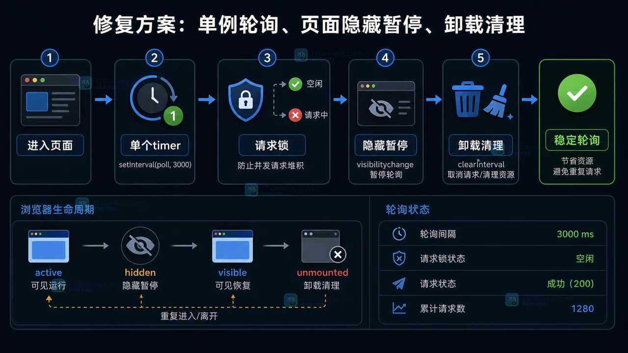
- 前端轮询接口越打越多怎么办:从重复定时器到清理机制一步步排查
- 490浏览 收藏
-
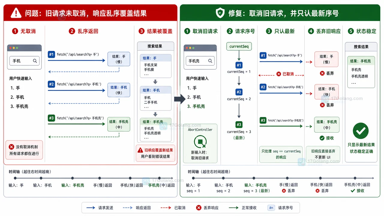
- 文章 · 前端 | 5天前 | 前端 · 搜索框 · AbortController · 接口请求 · 状态管理 · Fetch AbortController 前端搜索 请求乱序 旧响应覆盖
- 前端搜索结果倒退怎么办:AbortController 取消旧请求和序号兜底
- 295浏览 收藏
-
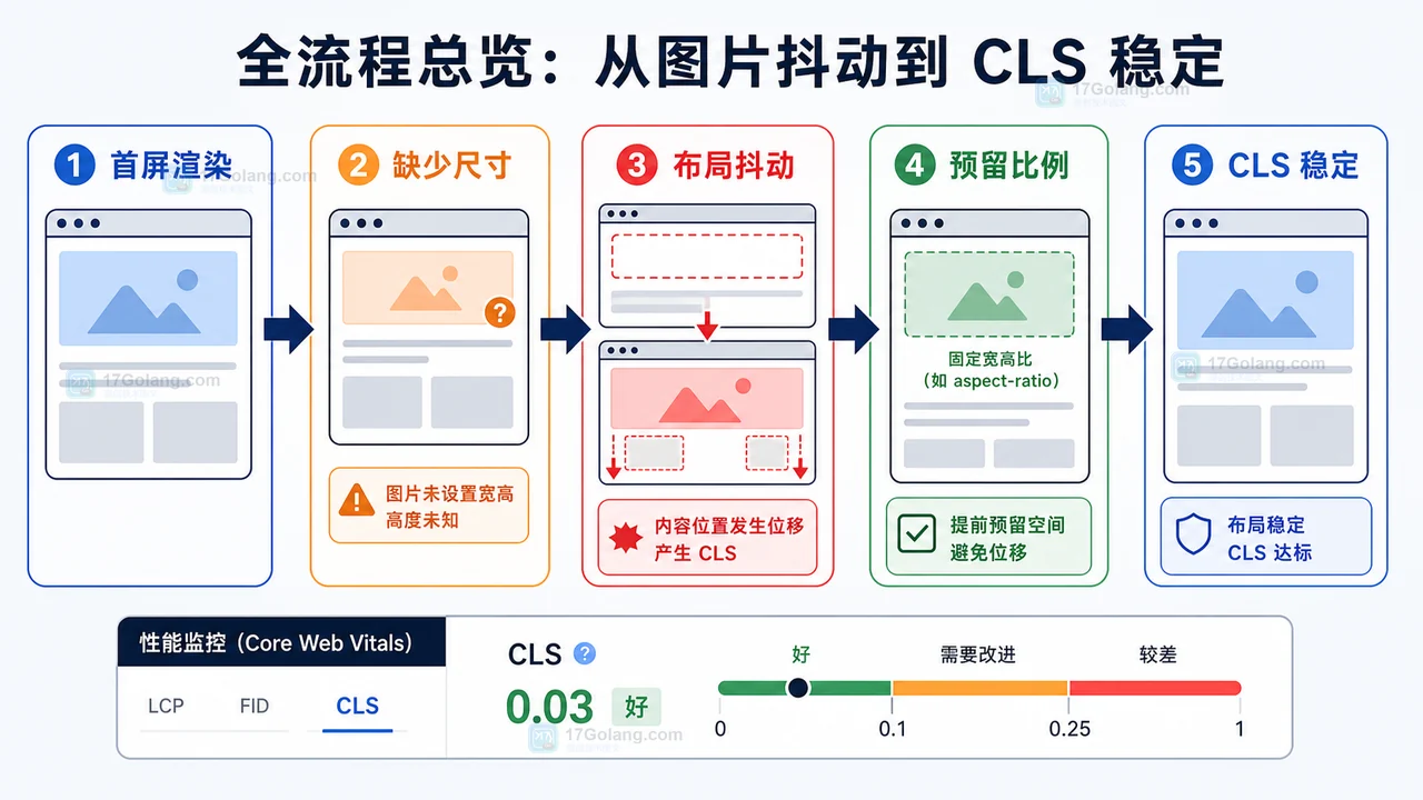
- 文章 · 前端 | 6天前 | 前端 · 性能优化 · cls · 懒加载 · Core Web Vitals · 前端 图片懒加载 IntersectionObserver CLS 布局稳定
- 前端图片懒加载布局抖动治理完整流程:占位比例、按需加载和 CLS 复查
- 128浏览 收藏
-
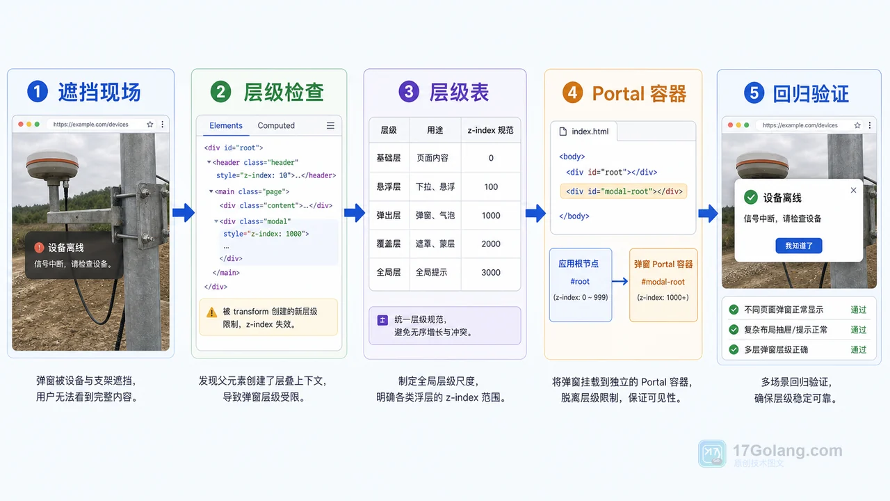
- 文章 · 前端 | 6天前 | 工程化 · 前端 · javascript · css · 弹窗 · 前端 z-index 遮罩层 stacking context Portal 弹窗层级
- 前端弹窗层级治理工作流:从 z-index 混乱到 Portal 容器规范
- 350浏览 收藏
-
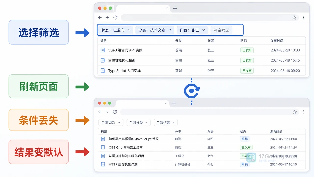
- 文章 · 前端 | 6天前 | 前端 · javascript · URL参数 · 列表筛选 · 页面状态 · 前端 筛选条件 列表页 history.replaceState URLSearchParams 刷新还原
- 前端筛选条件刷新后丢失怎么办:从内存状态到 URL 参数一步步排查
- 348浏览 收藏
-

- 前端进阶之JavaScript设计模式
- 设计模式是开发人员在软件开发过程中面临一般问题时的解决方案,代表了最佳的实践。本课程的主打内容包括JS常见设计模式以及具体应用场景,打造一站式知识长龙服务,适合有JS基础的同学学习。
- 543次学习
-

- GO语言核心编程课程
- 本课程采用真实案例,全面具体可落地,从理论到实践,一步一步将GO核心编程技术、编程思想、底层实现融会贯通,使学习者贴近时代脉搏,做IT互联网时代的弄潮儿。
- 516次学习
-

- 简单聊聊mysql8与网络通信
- 如有问题加微信:Le-studyg;在课程中,我们将首先介绍MySQL8的新特性,包括性能优化、安全增强、新数据类型等,帮助学生快速熟悉MySQL8的最新功能。接着,我们将深入解析MySQL的网络通信机制,包括协议、连接管理、数据传输等,让
- 500次学习
-

- JavaScript正则表达式基础与实战
- 在任何一门编程语言中,正则表达式,都是一项重要的知识,它提供了高效的字符串匹配与捕获机制,可以极大的简化程序设计。
- 487次学习
-

- 从零制作响应式网站—Grid布局
- 本系列教程将展示从零制作一个假想的网络科技公司官网,分为导航,轮播,关于我们,成功案例,服务流程,团队介绍,数据部分,公司动态,底部信息等内容区块。网站整体采用CSSGrid布局,支持响应式,有流畅过渡和展现动画。
- 485次学习
-

- ljg-skills
- ljg-skills 是李继刚开源的 AI 技能与提示词集合,面向大模型使用者整理了一批可复用的 prompt、角色设定和任务技能模板,适合用于学习提示词设计、搭建个人 AI 工作流和沉淀团队常用智能体能力。
- 1463次使用
-

- MELO音乐
- MELO音乐是一站式AI视频与音乐制作助手,对标suno, udio的高品质体验。提供伴奏生成、原创写词、无损导出、哼唱识曲、混音变声等全套音频与短视频编辑工具。无论是流行Kpop、电音说唱、民谣古风、摇滚儿歌还是商用轻音乐,MELO为你免费谱曲,轻松做同款!
- 1403次使用
-

- UniScribe
- UniScribe 是一款 AI 音视频转文字与内容整理工具,支持上传音频、视频文件或粘贴 YouTube 链接,自动生成转写文本、摘要、思维导图和关键问题,并支持多格式导出,适合会议记录、课程学习、访谈整理和内容创作复盘。
- 1357次使用
-

- 剧云
- 剧云是专业中文剧本创作平台,安全稳定运行十余年,集成AI编剧、剧本医生审核、人物小传、剧情关系图、大纲编写、多人协作、Word导入导出、版权管控功能,数据安全防护,轻松高效创作剧本。
- 1544次使用
-

- 万象有声
- 万象有声,一个专为有声创作者打造的新一代智能有声内容创作平台。平台提供专业的智能拆章、智能画本编辑、AI配音、AI生成音效、后期制作、智能对轨、智能审听等有声创作全流程工具,可以帮助创作者高效、低成本创作出引人入胜的有声作品。立即体验,让有声书制作更简单!
- 1528次使用
-
- JavaScript函数定义及示例详解
- 2025-05-11 502浏览
-
- 优化用户界面体验的秘密武器:CSS开发项目经验大揭秘
- 2023-11-03 501浏览
-
- 使用微信小程序实现图片轮播特效
- 2023-11-21 501浏览
-
- 解析sessionStorage的存储能力与限制
- 2024-01-11 501浏览
-
- 探索冒泡活动对于团队合作的推动力
- 2024-01-13 501浏览